This is a re creation of the Owl City I Must Be Dreaming song. It took us approximately 2 months to work on it and it took about a week to edit it. I hope you enjoy it. :)
We wanted to use different lighting techniques we learned in our tech class and put them to the test. We wanted to go for a light hearted effect so we shot mainly on sunny days so that the emotion would relate better.
Tuesday, June 19, 2012
Thursday, June 14, 2012
TECH PORTFOLIO!
White Background Setup.
CONCEPT: The concept of this video tutorial is to show viewers how to set up their own lights to illuminate the figure.
DESIGN PROCESS: My group had to identify what we needed to work on and how to set up and then from there we started brainstorming possible ways to film. After generating ideas and exploring some possibilities of where the lights should be placed we then moved around a little to refine the idea and thats when we started shooting.
TECHNICAL INFORMATION: My group filmed this video with a NIKON 3100
OPINION: In my opinion this video could of been done better on my behalf. I probably could of done without the Q- cards and i think the video would of turned out better if there was more of a close up.
CONCEPT: This video is a recreation of the movie Forrest. Gump. We had the chance to change the theme of the original and change it up a bit. So instead of the movie being a romance, comedy, coming of age, drama and Americana i changed it to a suspenseful horror movie.
DESIGN PROCESS: The design process of the movie trailer consisted of thinking of what the theme should be changed too then major brainstorming of movie clips and considering the best choice of clips and then i selected the clips i wanted to add after that i put them all together and finalized the video.
TECHNICAL INFORMATION: This video was created in IMovie
OPINION: In my opinion i thought i did a good job. At first i was doubting myself but then it started to come together and it worked out in the end.

Art Nouveau.
CONCEPT : The concept was to recreate and art style as well as a self-portrait.
DESIGN PROCESS:I firstly started out with a picture and then i manipulated it with the art styling in mind. After coming up with the general idea i moved on to finalizing it.
TECHNICAL INFORMATION: I created this poster in Illustrator. this image was 25x25 cm
OPINION: I thought this was the best i have done in illustrator so far and i am extremely pleased with it.
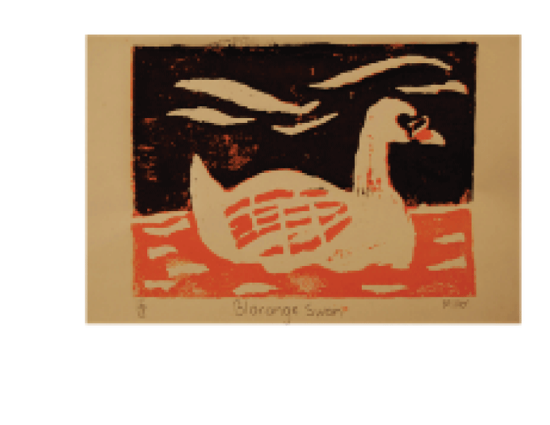
Blorange Swan.
CONCEPT: The concept of this Lino print was to create a bird of our choice by carving it and then printing it.
DESIGN PROCESS: Firstly we all had the chance to choose the bird we preferred to carve out then after some thought and position i carved it keeping in mind that i had to carve at least 70% in order to creat the focal point.
TECHNICAL INFORMATION: Linoleum tile with acrylic paint.
OPINION: In my opinion this was alright. I wouldn't say its my best work and i should of chose different colours.

Chinese Traditional Ink Painting.
CONCEPT:The concept of this piece was to show how much we had learned from the ink painting tutorial and attempt to illustrate a picture with the things we learned.
DESIGN PROCESS: Firstly i started off with choosing a composition and placement. I wanted to come up with various ideas and choose the best one. From there i was ready to experiment with different lines and after that i came up with the final composition.
TECHNICAL INFORMATION: Ink on rice paper
OPINION:In my opinion i thought this was a good attempt although i am not experienced at all, this was a good experience

Fragility.
CONCEPT: The concept of this was to show the definition of fragility
DESIGN PROCESS: I picked the word that i wasted to describe and after careful thought i decided to make the words crumple as if the word fragility was falling apart because of its main weakness.
TECHNICAL INFORMATION: This was done in illustrator
OPINION: I was very surprised to have come up with this idea because usually it takes me a while to actually choose something that would look appealing. In this case it all worked out.
 Owl City.
CONCEPT: The concept of this assignment was to make a poster for the music video my group created.
DESIGN PROCESS: In the beginning i knew i wanted the poster to look as professional as possible so i decided to use the same color concept as the other OWL CITY album and incorporate them into my recreation. From there i wanted to use a symbol that had a dream-like effect so i used 3 dimensional stars. The font i used was asinine, mostly because it was the closest looking font the band uses for their album covers.
TECHNICAL INFORMATION: This was done in Illustrator
OPINION: In my opinion i think that this is probably the best poster i have ever created...and the only one i have created
 Golden Griffin.
CONCEPT: The concept was to design a logo for a company.
DESIGN PROCESS: When i was thinking about my logo i wanted the logo to represent divine power and security as well as my "company" I decided to choose the griffin because it had various characteristics and appealing look. When i decided the color scheme i wanted to be very simplistic and choose white and yellow.
TECHNICAL INFORMATION: this piece was done in illustrator and photoshop.
OPINION: In my opinion i highly dislike this piece. I never liked the overall look and i felt as if i can do a better job now looking back on it.
Richie Valens.
CONCEPT: For this assignment the concept of this was to show how much we learned from kinetic typography.
DESIGN PROCESS: We spent weeks learning about helvetica and kinetic typography with audio so we had the chance to put what we had learned to the test. We had the chance to choose a song or poem and display it in words. After taking some time to decide what i wanted it to be i chose the song Your Mine by Richie Valens.
TECHNICAL INFORMATION: This whole video was made in flash.
OPINION: I thought that this was very hard to accomplish and i think that i could of done better.
 Fasai.
CONCEPT: The concept of this piece was to get a basic knowledge of painting.
DESIGN PROCESS: I wanted to paint someone so i decided to paint someone. i used a basic color palette and from there i didn't exactly put too much thought in my next steps. i just wanted to accomplish a regular fast painting so i can get an idea of how to learn from what i have done.
TECHNICAL INFORMATION: This painting was done on New Print paper with acrylic paint.
OPINION: In my opinion i thought i did well because this was the first painting i have ever done of someone.
 Still Life
CONCEPT: The concept of this piece was to demonstrate our use of gradient as well as composition.
DESIGN PROCESS: We had the chance to choose from a variety of items in-which we were going to attempt to sketch and then and from there we had to use a gradient scale to understand where the darks would go.
TECHNICAL INFORMATION: This piece was done on new print paper with HB.6B 3B AND 4B pencil
OPINION: I thought this was a great piece. I really liked the outcome of it.

Pencil.
CONCEPT: The concept was to make a new symbol for L.C.I Cyberarts
DESIGN PROCESS: The class had to go through alot of idea making until we decided to used the pencil. From there i took it into illustrator and filled it in to look like a cartoon picture of a pencil. Once it was done we had the chance to make a bigger scale poster with our finger prints.
TECHNICAL INFORMATION: This was done in illustrator.
OPINION: In my opinion i didn't think it turned out too good. I feel as if i could of done better with this assignment.

CONCEPT: The concept of this assignment was to make a poster for the music video my group created.
DESIGN PROCESS: In the beginning i knew i wanted the poster to look as professional as possible so i decided to use the same color concept as the other OWL CITY album and incorporate them into my recreation. From there i wanted to use a symbol that had a dream-like effect so i used 3 dimensional stars. The font i used was asinine, mostly because it was the closest looking font the band uses for their album covers.
TECHNICAL INFORMATION: This was done in Illustrator
OPINION: In my opinion i think that this is probably the best poster i have ever created...and the only one i have created
CONCEPT: The concept was to design a logo for a company.
DESIGN PROCESS: When i was thinking about my logo i wanted the logo to represent divine power and security as well as my "company" I decided to choose the griffin because it had various characteristics and appealing look. When i decided the color scheme i wanted to be very simplistic and choose white and yellow.
TECHNICAL INFORMATION: this piece was done in illustrator and photoshop.
OPINION: In my opinion i highly dislike this piece. I never liked the overall look and i felt as if i can do a better job now looking back on it.
Richie Valens.
CONCEPT: For this assignment the concept of this was to show how much we learned from kinetic typography.
DESIGN PROCESS: We spent weeks learning about helvetica and kinetic typography with audio so we had the chance to put what we had learned to the test. We had the chance to choose a song or poem and display it in words. After taking some time to decide what i wanted it to be i chose the song Your Mine by Richie Valens.
TECHNICAL INFORMATION: This whole video was made in flash.
OPINION: I thought that this was very hard to accomplish and i think that i could of done better.
CONCEPT: The concept of this piece was to get a basic knowledge of painting.
DESIGN PROCESS: I wanted to paint someone so i decided to paint someone. i used a basic color palette and from there i didn't exactly put too much thought in my next steps. i just wanted to accomplish a regular fast painting so i can get an idea of how to learn from what i have done.
TECHNICAL INFORMATION: This painting was done on New Print paper with acrylic paint.
OPINION: In my opinion i thought i did well because this was the first painting i have ever done of someone.

CONCEPT: The concept of this piece was to demonstrate our use of gradient as well as composition.
DESIGN PROCESS: We had the chance to choose from a variety of items in-which we were going to attempt to sketch and then and from there we had to use a gradient scale to understand where the darks would go.
TECHNICAL INFORMATION: This piece was done on new print paper with HB.6B 3B AND 4B pencil
OPINION: I thought this was a great piece. I really liked the outcome of it.

Pencil.
CONCEPT: The concept was to make a new symbol for L.C.I Cyberarts
DESIGN PROCESS: The class had to go through alot of idea making until we decided to used the pencil. From there i took it into illustrator and filled it in to look like a cartoon picture of a pencil. Once it was done we had the chance to make a bigger scale poster with our finger prints.
TECHNICAL INFORMATION: This was done in illustrator.
OPINION: In my opinion i didn't think it turned out too good. I feel as if i could of done better with this assignment.
Tuesday, June 12, 2012
3 POINT LIGHTING VIDEOS
The second video is the Black background setup. This setup consists of the fill light the key light and the hair light. In this case we used a mirror to be used as the hair light instead. The key light is positioned around 45 degrees and about 1 meter away set on full power on the subject causing a harsh light on the side of the subjects face. The fill light helps even out the brightness. Although the fill light is only set to half the power as of the key light. The hair light or in this case the mirror is used to illuminate the subject so their body does not fade into the background.
The third video is the film Noir setup. The key light is positioned right in front of the subject and it will light them and it is on half power. The brightest light is positioned towards the black background and it is called the fill light. The third light is the highlight or in this case the mirror. this is directed a little further behind the subject and angled towards the camera on the lowest setting.
Owl City Poster

My design: For the overall design of the poster i wanted to stick with the same color as their actual album which is :blue and pink. I figured that since the lyrics of the song seemed out of the ordinary and colourful i wanted to go with a patterned background to show how scattered yet fluent the feelings are of the song. The stars finished and brought the piece together. The stars symbolized the "Dreaming" portion of the album name. I tried to stay simple with putting the font directly in the middle so it leads the viewers eyes down towards the stars or vice versa.
30 Best Music Video
so these are the top 30 videos in the past 3 decades. We were suppose to take a look and analyse different aspects that make up the videos.
1980's
Talking Heads 'Once in a Lifetime' (1980)
So i think it would be only right to start off with the first video of the segment which is: Talking Heads 'Once in a Lifetime' (1980)
as you can see the use of the Green-screen is in full blast as well with his corny dancing makes for a huge success. In my opinion i was thrilled to watch this video and it was boring. It seems as if he stayed in the same place the whole time, and although the camera did some close ups, it wasn't exactly satisfying. It was exhibited in New Yorks Museum of Modern Art. This video was recognized as "brilliant bizarreness". People enjoyed the video because of it.
Michael Jackson, Thriller (1984)
Michael Jackson is known as an icon in the world of music and the King of Pop, so it would make sense to take a look at his well known song Thriller. In my opinion this video was pure genius. From start to finish we see an engaging dialogue, anticipation, amazing costume and makeup as well as an impressive plot. Not to mention the lyrics and the camera angles. We can tell that this videos style originated in the 1980s but the artistic expression definitely evens it out and accommodates the video with suspense as well as good visuals.
1990s
The Beastie Boys 'Sabotage' (1994)
The Beastie boys are at it again with their "mischievous humor and anarchic energy" we get to see them as mustache - donut- eating cops. In my opinion i think this video was well done. It was simple yet different. They had impressive technical precision with the different camera angles and spinning. It had a variety of close-ups far shots as well as a man falling from a building. Nothing is better than the action and the characters they portrayed. The pacing was fast and up beat and the style was so 70's.
Missy Elliott, 'The Rain (Supa Dupa Fly)' (1997)
Missy Elliott also known as the Queen of hip hop made the Turn -of-The-Century music video which included extended booty dancing hummers and outrageous outfits. In my opinion this is what makes up for a good music video. Almost everything is incorporated in it from garbage bag suits to stutter-step choreography. They used a tremendous amount of harsh lighting, and the pacing is different from most of the traditional videos.
2000
Johnny Cash, 'Hurt' (2003)
Johnny Cash was well-known for his classic songs throughout the decades such as: ring of fire. The inspiration for this video would have to be his overall health and mental state throughout the years. I thought this video was genius because it showed us his timeline through pictures while he sings aboutu his past feelings and "stains of time" The style is modern but contrast with his age so it becomes more appropriate to watch.
OK Go, 'Here It Goes Again' (2006)
When i first watched this video i thought it was amazingly different mostly because i found out that the whole video was taken in one shot! It took them 17 times to get it right but when they did, viewers were amazed with the choreography and this earned them 50 million views as well as a grammy!
I think the most artistic aspect would be the use of treadmills while dancing from one to the other. You can tell that the lighting is very basic and harsh at both sides.
Subscribe to:
Posts (Atom)