White Background Setup.
CONCEPT: The concept of this video tutorial is to show viewers how to set up their own lights to illuminate the figure.
DESIGN PROCESS: My group had to identify what we needed to work on and how to set up and then from there we started brainstorming possible ways to film. After generating ideas and exploring some possibilities of where the lights should be placed we then moved around a little to refine the idea and thats when we started shooting.
TECHNICAL INFORMATION: My group filmed this video with a NIKON 3100
OPINION: In my opinion this video could of been done better on my behalf. I probably could of done without the Q- cards and i think the video would of turned out better if there was more of a close up.
CONCEPT: This video is a recreation of the movie Forrest. Gump. We had the chance to change the theme of the original and change it up a bit. So instead of the movie being a romance, comedy, coming of age, drama and Americana i changed it to a suspenseful horror movie.
DESIGN PROCESS: The design process of the movie trailer consisted of thinking of what the theme should be changed too then major brainstorming of movie clips and considering the best choice of clips and then i selected the clips i wanted to add after that i put them all together and finalized the video.
TECHNICAL INFORMATION: This video was created in IMovie
OPINION: In my opinion i thought i did a good job. At first i was doubting myself but then it started to come together and it worked out in the end.

Art Nouveau.
CONCEPT : The concept was to recreate and art style as well as a self-portrait.
DESIGN PROCESS:I firstly started out with a picture and then i manipulated it with the art styling in mind. After coming up with the general idea i moved on to finalizing it.
TECHNICAL INFORMATION: I created this poster in Illustrator. this image was 25x25 cm
OPINION: I thought this was the best i have done in illustrator so far and i am extremely pleased with it.
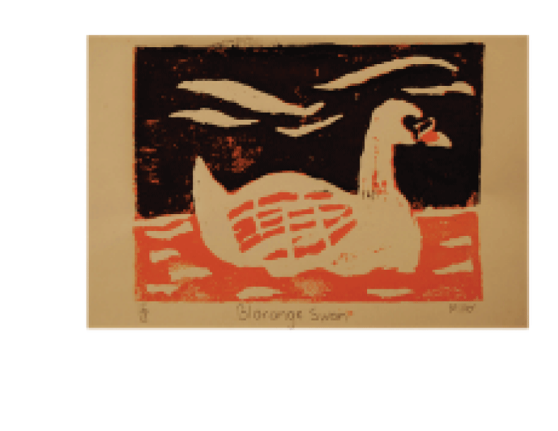
Blorange Swan.
CONCEPT: The concept of this Lino print was to create a bird of our choice by carving it and then printing it.
DESIGN PROCESS: Firstly we all had the chance to choose the bird we preferred to carve out then after some thought and position i carved it keeping in mind that i had to carve at least 70% in order to creat the focal point.
TECHNICAL INFORMATION: Linoleum tile with acrylic paint.
OPINION: In my opinion this was alright. I wouldn't say its my best work and i should of chose different colours.

Chinese Traditional Ink Painting.
CONCEPT:The concept of this piece was to show how much we had learned from the ink painting tutorial and attempt to illustrate a picture with the things we learned.
DESIGN PROCESS: Firstly i started off with choosing a composition and placement. I wanted to come up with various ideas and choose the best one. From there i was ready to experiment with different lines and after that i came up with the final composition.
TECHNICAL INFORMATION: Ink on rice paper
OPINION:In my opinion i thought this was a good attempt although i am not experienced at all, this was a good experience

Fragility.
CONCEPT: The concept of this was to show the definition of fragility
DESIGN PROCESS: I picked the word that i wasted to describe and after careful thought i decided to make the words crumple as if the word fragility was falling apart because of its main weakness.
TECHNICAL INFORMATION: This was done in illustrator
OPINION: I was very surprised to have come up with this idea because usually it takes me a while to actually choose something that would look appealing. In this case it all worked out.
 Owl City.
CONCEPT: The concept of this assignment was to make a poster for the music video my group created.
DESIGN PROCESS: In the beginning i knew i wanted the poster to look as professional as possible so i decided to use the same color concept as the other OWL CITY album and incorporate them into my recreation. From there i wanted to use a symbol that had a dream-like effect so i used 3 dimensional stars. The font i used was asinine, mostly because it was the closest looking font the band uses for their album covers.
TECHNICAL INFORMATION: This was done in Illustrator
OPINION: In my opinion i think that this is probably the best poster i have ever created...and the only one i have created
 Golden Griffin.
CONCEPT: The concept was to design a logo for a company.
DESIGN PROCESS: When i was thinking about my logo i wanted the logo to represent divine power and security as well as my "company" I decided to choose the griffin because it had various characteristics and appealing look. When i decided the color scheme i wanted to be very simplistic and choose white and yellow.
TECHNICAL INFORMATION: this piece was done in illustrator and photoshop.
OPINION: In my opinion i highly dislike this piece. I never liked the overall look and i felt as if i can do a better job now looking back on it.
Richie Valens.
CONCEPT: For this assignment the concept of this was to show how much we learned from kinetic typography.
DESIGN PROCESS: We spent weeks learning about helvetica and kinetic typography with audio so we had the chance to put what we had learned to the test. We had the chance to choose a song or poem and display it in words. After taking some time to decide what i wanted it to be i chose the song Your Mine by Richie Valens.
TECHNICAL INFORMATION: This whole video was made in flash.
OPINION: I thought that this was very hard to accomplish and i think that i could of done better.
 Fasai.
CONCEPT: The concept of this piece was to get a basic knowledge of painting.
DESIGN PROCESS: I wanted to paint someone so i decided to paint someone. i used a basic color palette and from there i didn't exactly put too much thought in my next steps. i just wanted to accomplish a regular fast painting so i can get an idea of how to learn from what i have done.
TECHNICAL INFORMATION: This painting was done on New Print paper with acrylic paint.
OPINION: In my opinion i thought i did well because this was the first painting i have ever done of someone.
 Still Life
CONCEPT: The concept of this piece was to demonstrate our use of gradient as well as composition.
DESIGN PROCESS: We had the chance to choose from a variety of items in-which we were going to attempt to sketch and then and from there we had to use a gradient scale to understand where the darks would go.
TECHNICAL INFORMATION: This piece was done on new print paper with HB.6B 3B AND 4B pencil
OPINION: I thought this was a great piece. I really liked the outcome of it.

Pencil.
CONCEPT: The concept was to make a new symbol for L.C.I Cyberarts
DESIGN PROCESS: The class had to go through alot of idea making until we decided to used the pencil. From there i took it into illustrator and filled it in to look like a cartoon picture of a pencil. Once it was done we had the chance to make a bigger scale poster with our finger prints.
TECHNICAL INFORMATION: This was done in illustrator.
OPINION: In my opinion i didn't think it turned out too good. I feel as if i could of done better with this assignment.

CONCEPT: The concept of this assignment was to make a poster for the music video my group created.
DESIGN PROCESS: In the beginning i knew i wanted the poster to look as professional as possible so i decided to use the same color concept as the other OWL CITY album and incorporate them into my recreation. From there i wanted to use a symbol that had a dream-like effect so i used 3 dimensional stars. The font i used was asinine, mostly because it was the closest looking font the band uses for their album covers.
TECHNICAL INFORMATION: This was done in Illustrator
OPINION: In my opinion i think that this is probably the best poster i have ever created...and the only one i have created
CONCEPT: The concept was to design a logo for a company.
DESIGN PROCESS: When i was thinking about my logo i wanted the logo to represent divine power and security as well as my "company" I decided to choose the griffin because it had various characteristics and appealing look. When i decided the color scheme i wanted to be very simplistic and choose white and yellow.
TECHNICAL INFORMATION: this piece was done in illustrator and photoshop.
OPINION: In my opinion i highly dislike this piece. I never liked the overall look and i felt as if i can do a better job now looking back on it.
Richie Valens.
CONCEPT: For this assignment the concept of this was to show how much we learned from kinetic typography.
DESIGN PROCESS: We spent weeks learning about helvetica and kinetic typography with audio so we had the chance to put what we had learned to the test. We had the chance to choose a song or poem and display it in words. After taking some time to decide what i wanted it to be i chose the song Your Mine by Richie Valens.
TECHNICAL INFORMATION: This whole video was made in flash.
OPINION: I thought that this was very hard to accomplish and i think that i could of done better.
CONCEPT: The concept of this piece was to get a basic knowledge of painting.
DESIGN PROCESS: I wanted to paint someone so i decided to paint someone. i used a basic color palette and from there i didn't exactly put too much thought in my next steps. i just wanted to accomplish a regular fast painting so i can get an idea of how to learn from what i have done.
TECHNICAL INFORMATION: This painting was done on New Print paper with acrylic paint.
OPINION: In my opinion i thought i did well because this was the first painting i have ever done of someone.

CONCEPT: The concept of this piece was to demonstrate our use of gradient as well as composition.
DESIGN PROCESS: We had the chance to choose from a variety of items in-which we were going to attempt to sketch and then and from there we had to use a gradient scale to understand where the darks would go.
TECHNICAL INFORMATION: This piece was done on new print paper with HB.6B 3B AND 4B pencil
OPINION: I thought this was a great piece. I really liked the outcome of it.

Pencil.
CONCEPT: The concept was to make a new symbol for L.C.I Cyberarts
DESIGN PROCESS: The class had to go through alot of idea making until we decided to used the pencil. From there i took it into illustrator and filled it in to look like a cartoon picture of a pencil. Once it was done we had the chance to make a bigger scale poster with our finger prints.
TECHNICAL INFORMATION: This was done in illustrator.
OPINION: In my opinion i didn't think it turned out too good. I feel as if i could of done better with this assignment.
No comments:
Post a Comment